Goth: A History
by Lol Tolhurst
As a co-founder of The Cure, no one is better suited to write this book than Lol Tolhurst. Considering his unique insight from the subculture’s very beginnings, I wanted this book to feel like the definitive work on the subject. This meant ensuring the cover didn’t descend into what my wife calls “lowest gothic denominator”—think bats, spider webs, scantily-clad vamps in black lipstick, etc. My design was informed by seminal album art of the period, and incorporated a particularly forlorn photograph of the sea taken by the author..

Hardcover with half jacket

Hardcover case with half-jacket removed.
Typography
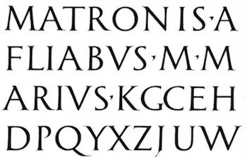
I wanted the typography to intentionally reference important artifacts of the subculture. Joy Division are perhaps the most obvious candidate for most iconic Goth band, but the exploding star diagram on their debut Unknown Pleasures, is so well known that it has fully entered the mainstream. In researching the typography used for Joy Division’s second and final album Closer, I learned that designer Peter Saville had found the Roman carved letterforms in the book Die Schriftentwicklung (The Development of Writing), published in Switzerland in 1959. For verisimilitude, I hunted down a copy of the same printing, in order to perfectly replicate that iconic lettering for the title.


For the paperback, Lol surprised me by selecting one of my unused directions for the hardcover. This ultra-minimal cover features a dagger, or obelus—a typographic symbol used to indicate the death of a person. The “death dagger” prints gloss black onto a matte black background.

Fittingly, the paperback has black painted edges. The title and author, in stark white Helvetica, provide the only relief from complete blackness.