Johnson & Johnson: Baby Care
PROJECT OVERVIEW
As an early member of the Johnson & Johnson Global Strategic Design Office, I collaborated with business leadership, R&D, packaging engineers, marketing, external advertising agencies, and local and global manufacturers for the Johnson’s Baby and Clean & Clear portfolio of products across the globe. The brand refresh of the iconic Johnson’s Baby products was particularly challenging, requiring multiple rounds of testing, international manufacturer and business team negotiation, as well as navigating the different production capabilities and category conventions across regions to ensure a globally consistent product.
CREDITS
Agency: Johnson & Johnson
Global Strategic Design Office
CCO: Chris Hacker
CD: Todd True
Strategy Director: Christina Geist
Design Director: Timothy O’Donnell
Sr Designer: Stephen Bramwell
Sr. Designer: Raluca Preda
Agency Partners:
Invok Brands
VSA Partners
SYPartners
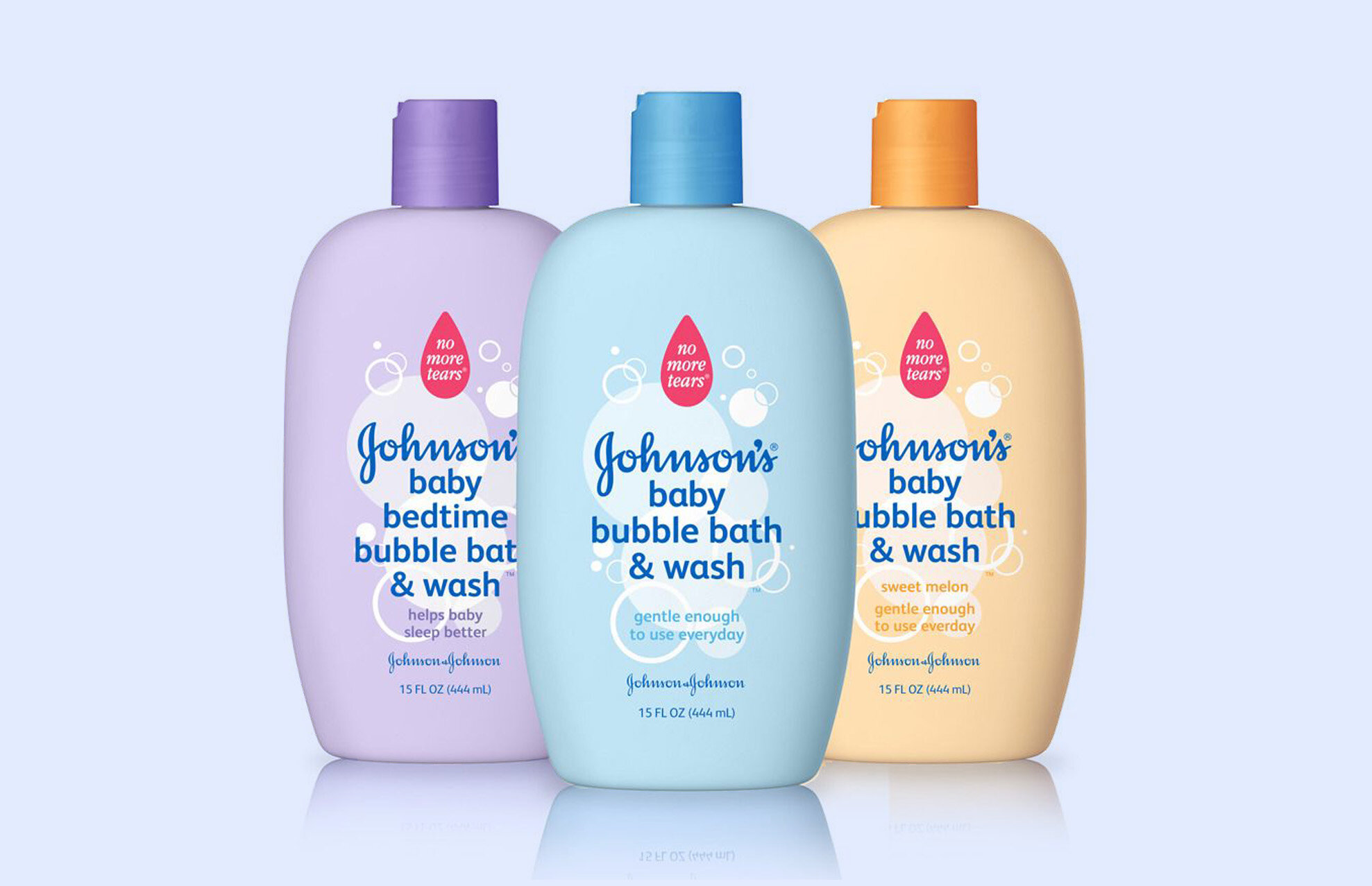
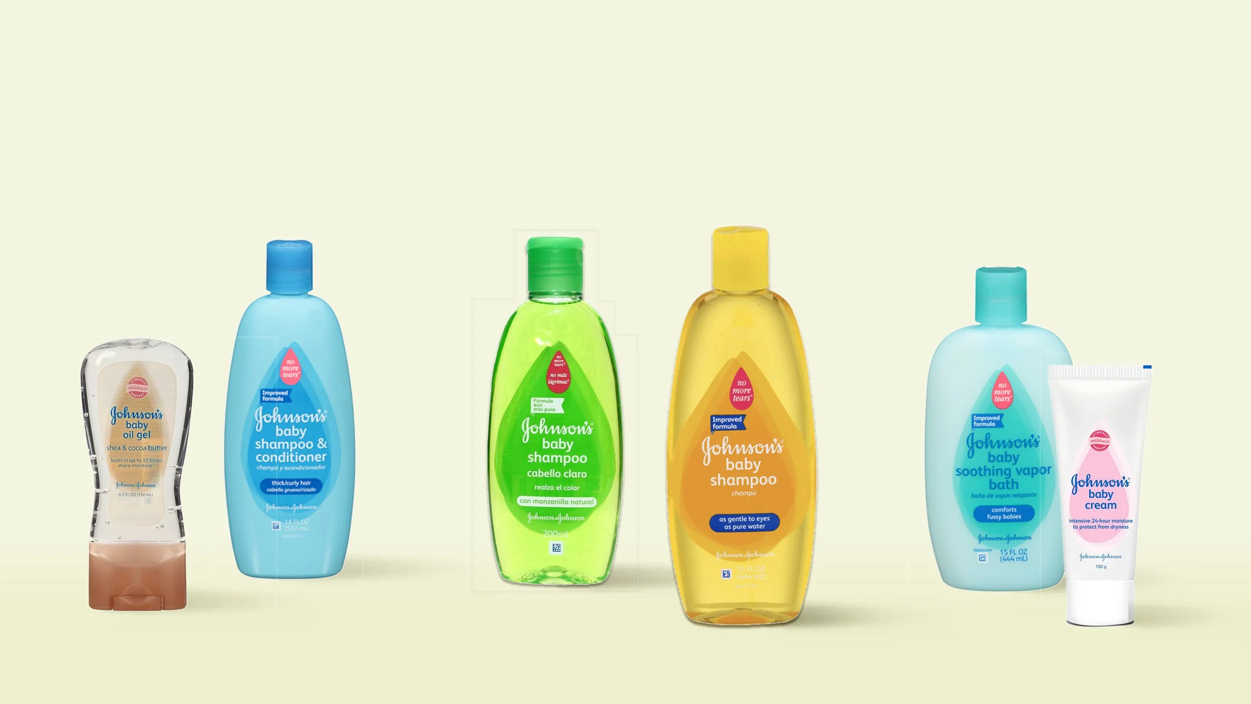
Johnson’s Baby: Global Redesign

The carefully considered evolution of an icon.
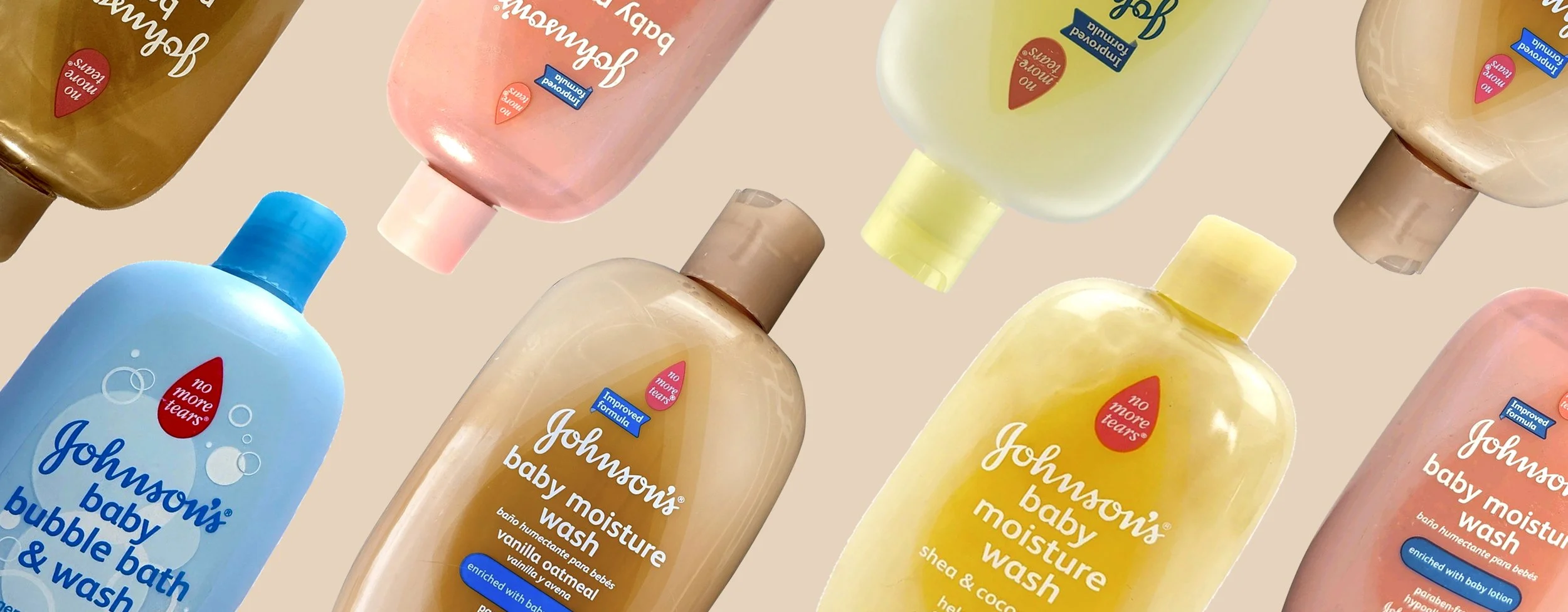
Johnson’s Baby products are beloved around the world. However, as private label competition increased, Johnson’s market share was dropping steadily. The brand needed to rethink how it communicated to parents on shelf, online, and in people’s homes.
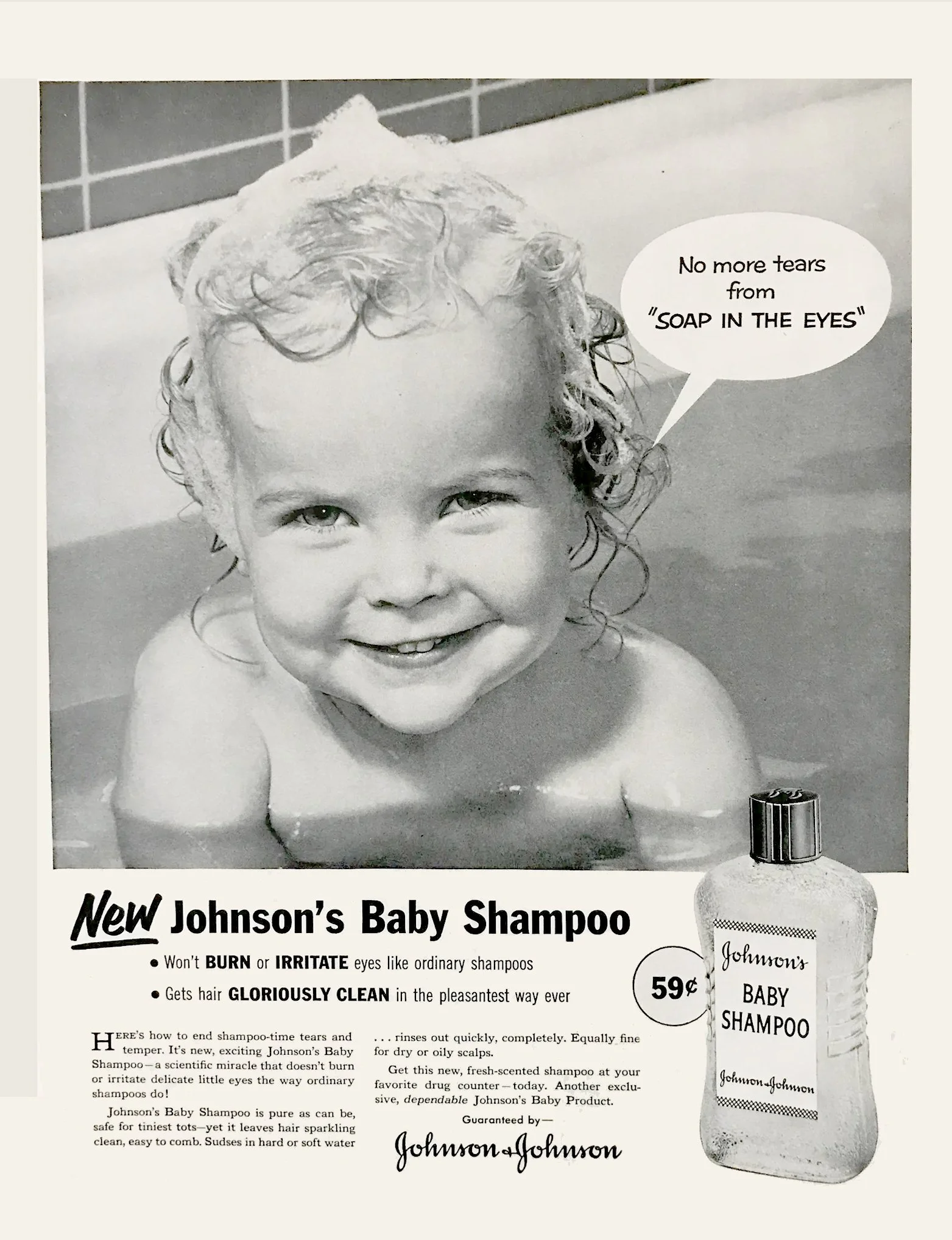
During extensive research (spanning formal focus groups to spending the day with new parents), we saw first hand the role Johnson’s plays in parent’s lives, and indeed their own memories of childhood. Many legacy elements such as the “Johnson’s” script and the bottle shape had too strong a recall to tinker with, as did the “No More Tears” icon, first introduced in 1953. However, over the years, the now enormous portfolio of Johnson’s Baby products had become confusing and inconsistent in its graphics. The project became an exercise in gathering and studying data about our packaging, then convincing global brand teams of the business rationale for bringing the line into greater alignment.

Typography
The Baskerville bold italic currently in use felt fussy and somewhat dated, and jarred with Johnson’s ornate logo. We initially tried Futura but its rigid geometry felt a little sterile.
FS Albert, by Fontsmith, had more human warmth in its characters—its single story ‘a’ in particular felt friendly and inviting. Crucially, its fantastic language support helped keep the portfolio consistent between countries.
Results
After years of declining market share, the redesigned Johnson’s Baby packaging helped the BabyCare business grow
+5.9%
Penaten — A German Icon
Developed in 1904, Penaten is a beloved brand in Germany — fondly remembered from new mother’s own childhoods. Johnson & Johnson acquired the brand in the 1980s, and over the years, the brand gradually lost its identity. Cost efficiencies led to using existing and recognizable Johnson’s Baby structures and iconography, diminishing the brand’s recognition and emotional connection with consumers.
When we heard about an art exhibit featuring the Penaten creme tin, we realized that that product specifically held a special place in Germans’ hearts, and was a cultural touchstone in the way that Warhol’s Campbell’s soup cans were.We decided to use that tin as the basis for the redesign as a whole.


We first refined the logo to more closely follow the design of the creme tin. Iillustrator Michael Schwab, known for his stylish, simplified images, was hired to redraw the iconic shepherd and his dog. Since this design has such history behind it, we tread carefully in what we adjusted.to stay authentic to the brand’s past. (Though we did change the dog to a gentle sheep to better cue baby care)
We partnered closely with our team of packaging engineers to try and create a bottle form that was as circular as possible, to further mimic the tin. The realities of the PET material and the fill requirements meant that we didn’t get quite as round as we had hoped; but still managed to find a form that gave the circular logo room to take center stage.

Miscellaneous

Natusan — Baby Care from Sweden
While we were only tasked with refreshing the Natusan graphics, we were able to move the brand into the new Penaten structure. This gave us a softer, more rounded bottle, with more billboard space on front of pack to house their delicate swan logo with its subtle gradations.

Johnson’s Bedtime Wash redesign. Illustration and lettering by Bob Shea.
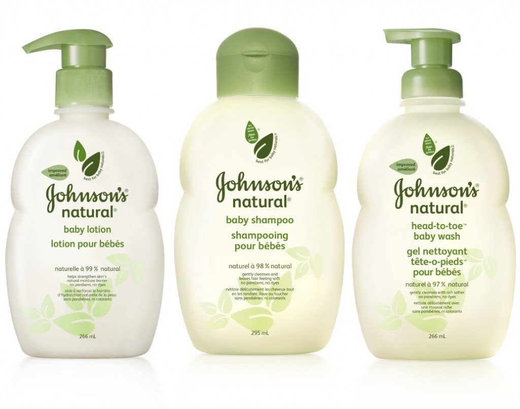
Johnson’s Natural line launch