Razorfish Identity
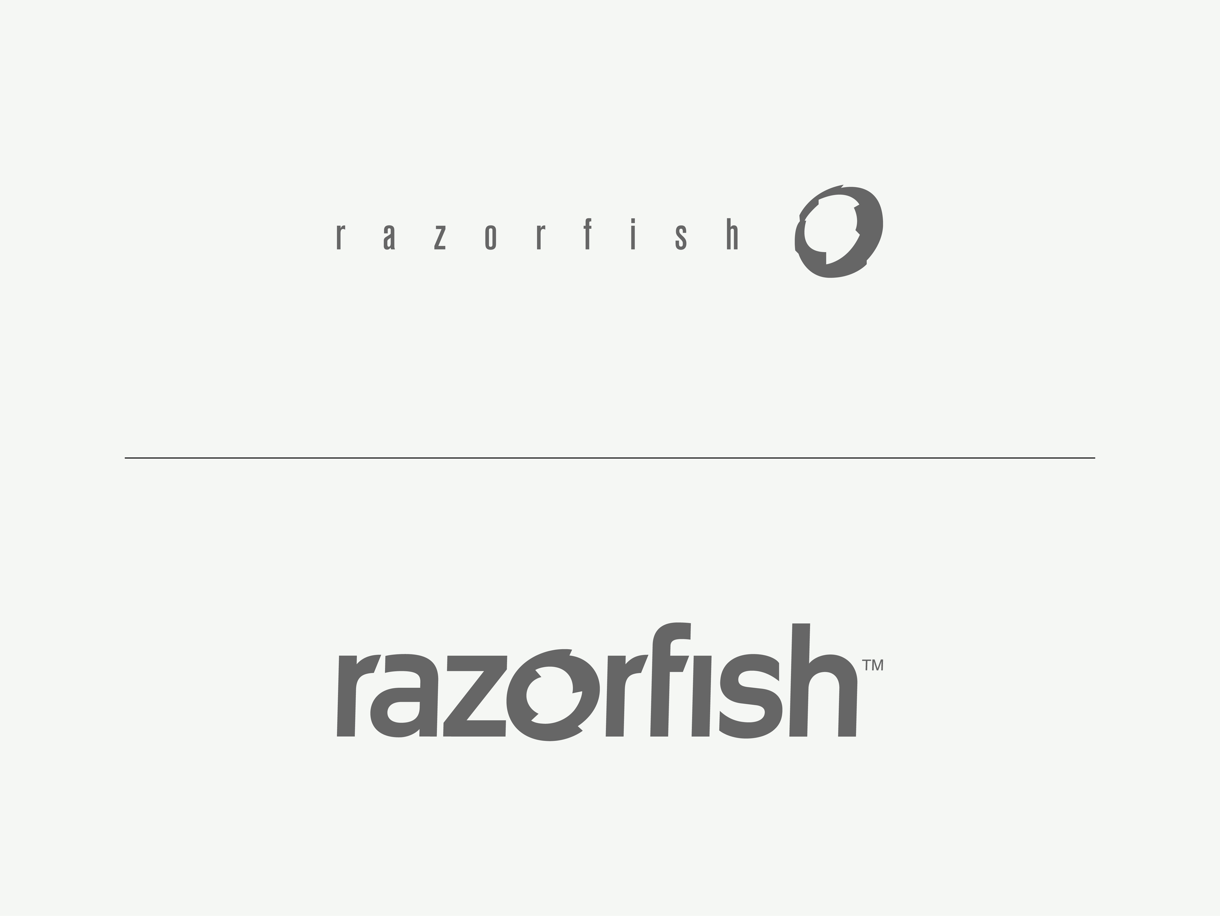
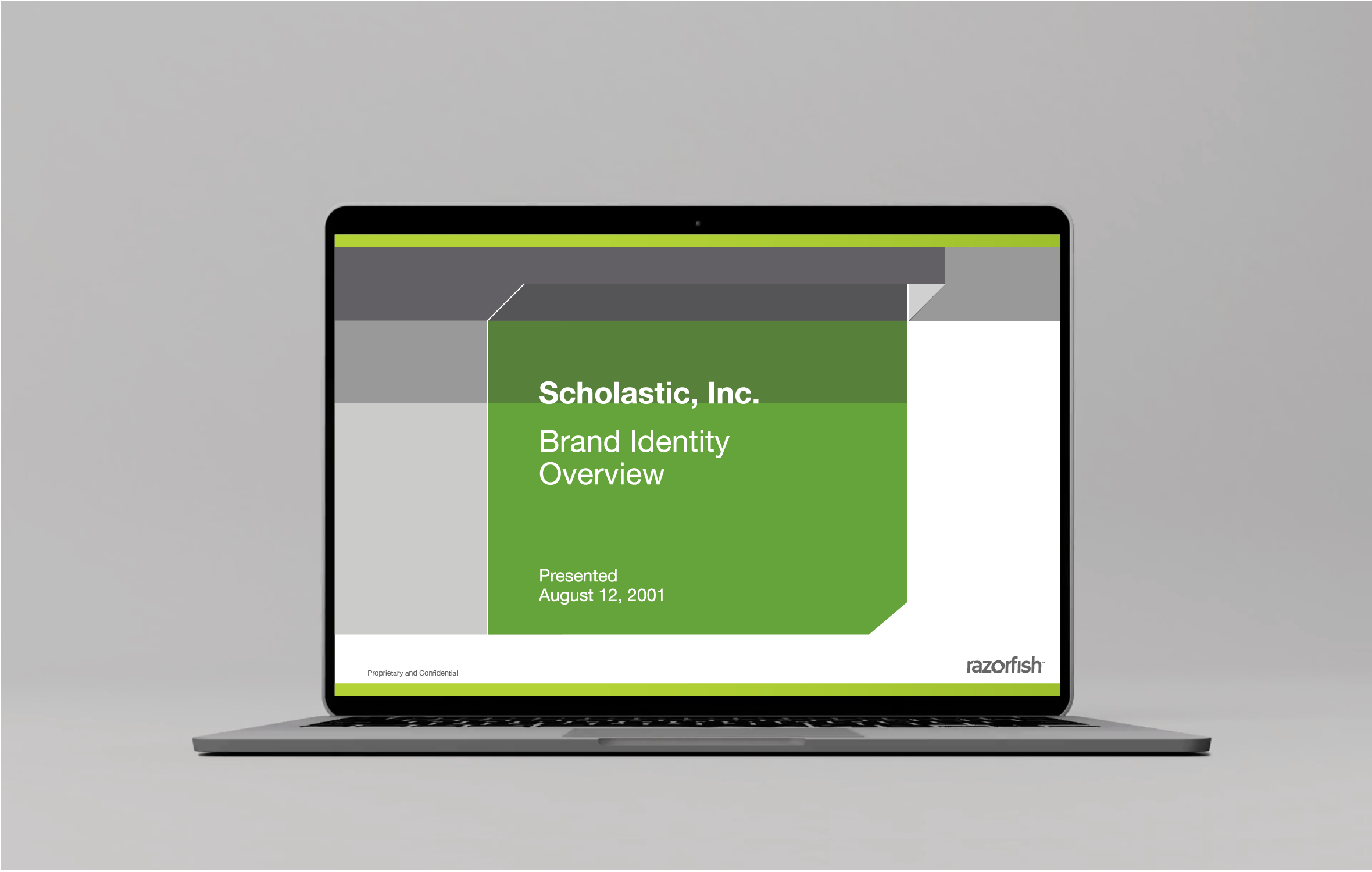
Razorfish’s original logo struggled with legibility on screen—a fatal flaw for a digital transformation agency. In partnership with VP for Design Thomas Mueller, I developed a new identity system that retained some of the core colors and shapes of the original, but streamlined them for digital use. The new logotype, based on the DIN typeface, was reworked by typographer Cyrus Highsmith to ensure the details were optimized for display on screens. A full suite of signage, stationery, and digital assets was created; I managed their production across all 11 of Razorfish’s global offices.


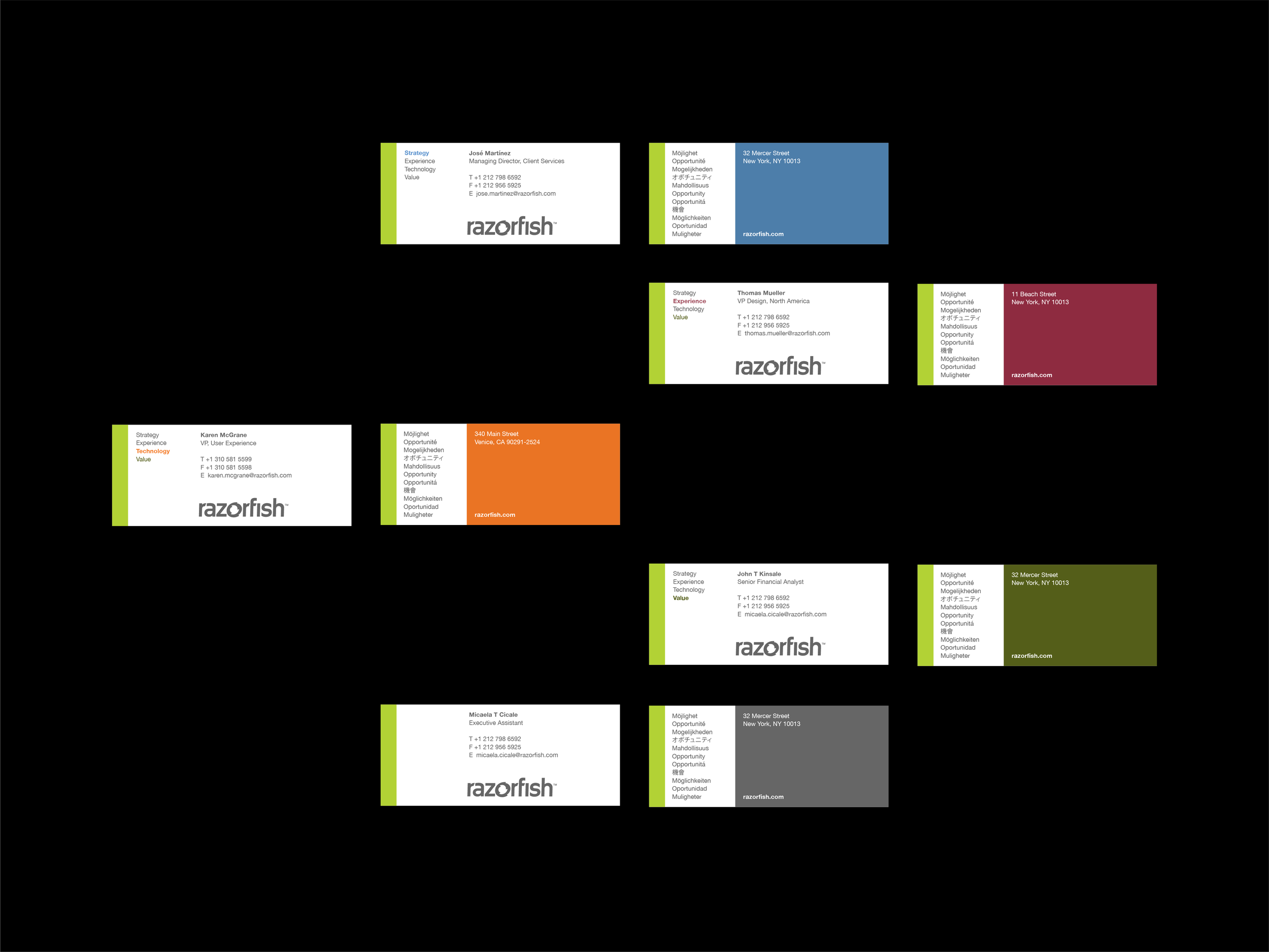
Razorfish's client-facing staff were reorganized into four networks—Strategy, Experience, Technology and Value. The evolved identity introduced a secondary color palette so each network could retain its own identity within the overall Razorgish brand.