Le Petit Marseillais
This beloved French brand has been owned by Johnson & Johnson (now Kenvue) since the early 2000s. When considering introducing the brand to American consumers, a design sprint explored whether this children’s brand could be reframed as a luxury adult skincare line, competing with the likes of Le Occitane.
Existing Packaging
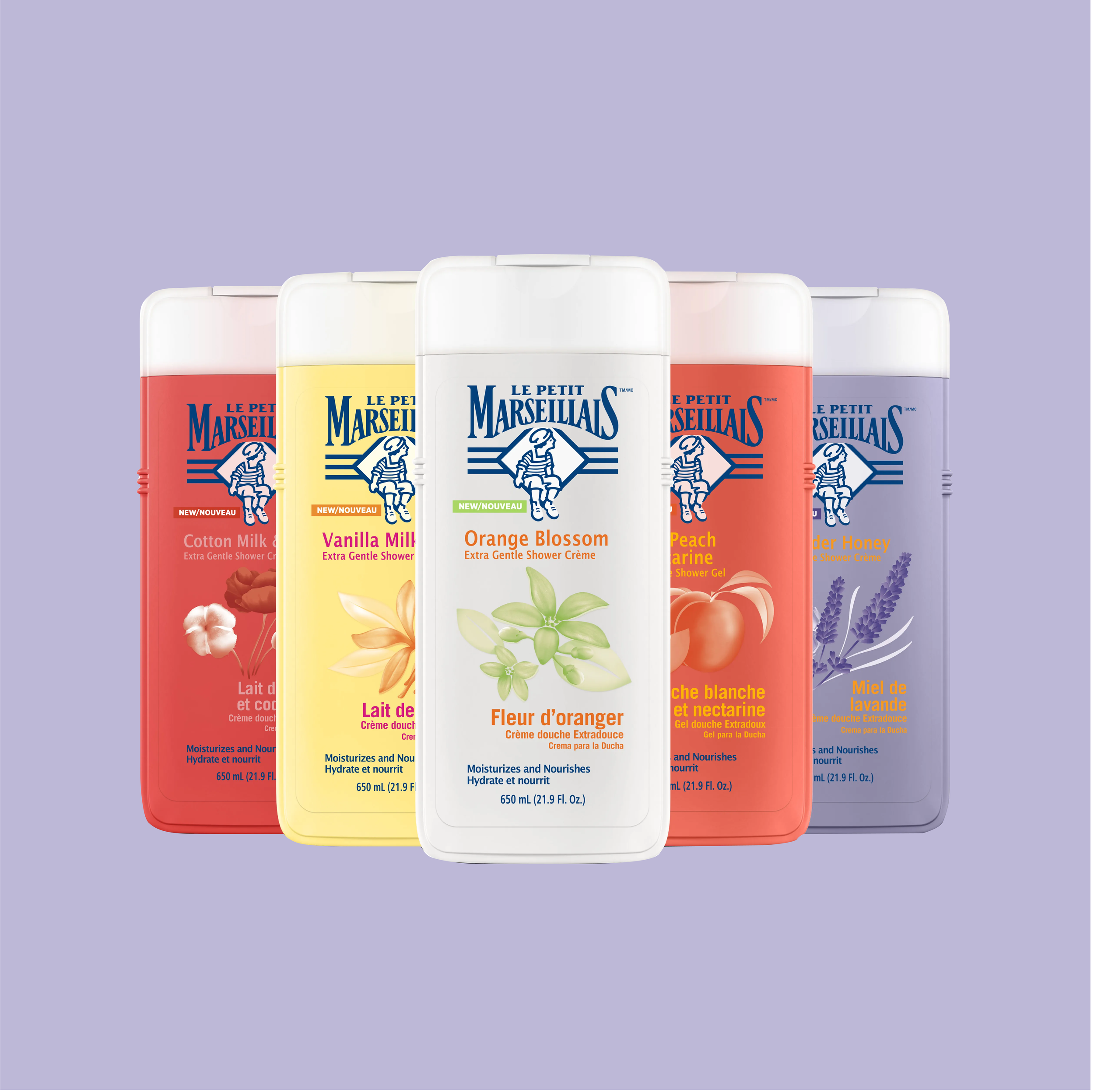
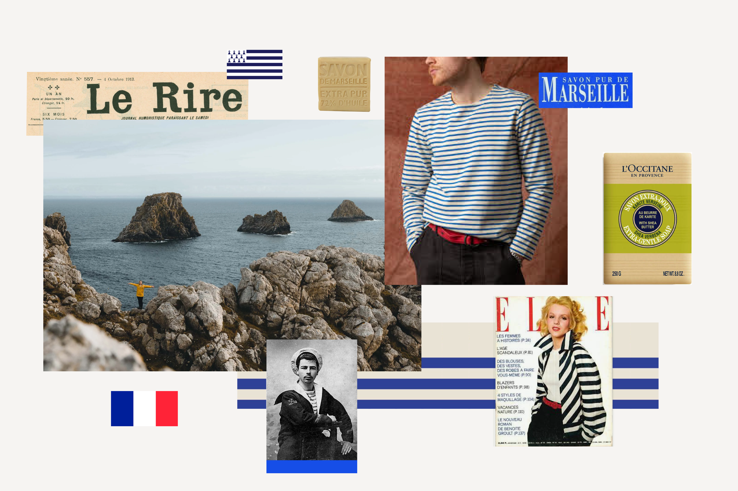
Le Petit Marseillais was founded in 1982, inspired by the scents of Provence and the handmade soap that Marseille is famed for. While many of the ingredients used, such as almond oil and lavender, reflect the brand’s roots in southern France, little on the packaging is particularly evocative of the region.
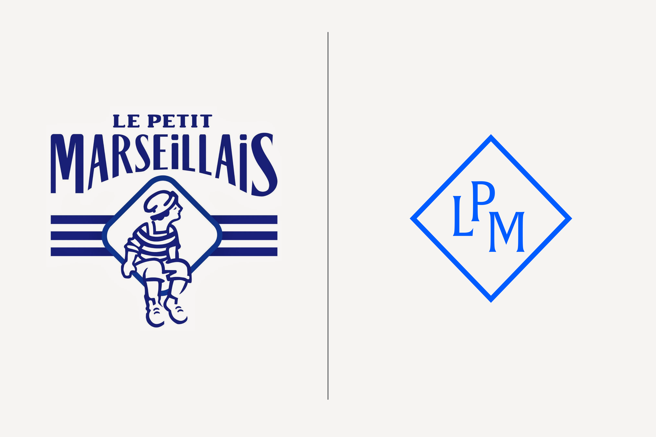
Existing Symbol
The existing logo features a small boy wearing a mariniére—the white and blue striped shirt made famous by the French Navy. Three more blue stripes run behind the boy to further evoke this iconic garment.
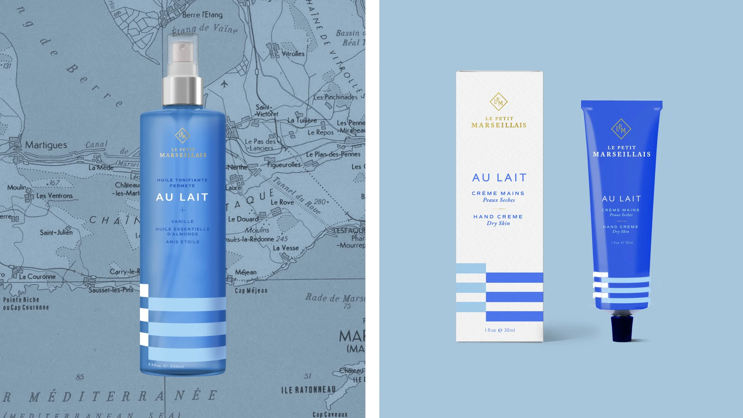
A New Adult Symbol
This evolution removes the child from the symbol, but keeps the diamond shape as a frame for a monogram. The blue brightens, and the mariniére stripes play a strong role elsewhere on that packaging.
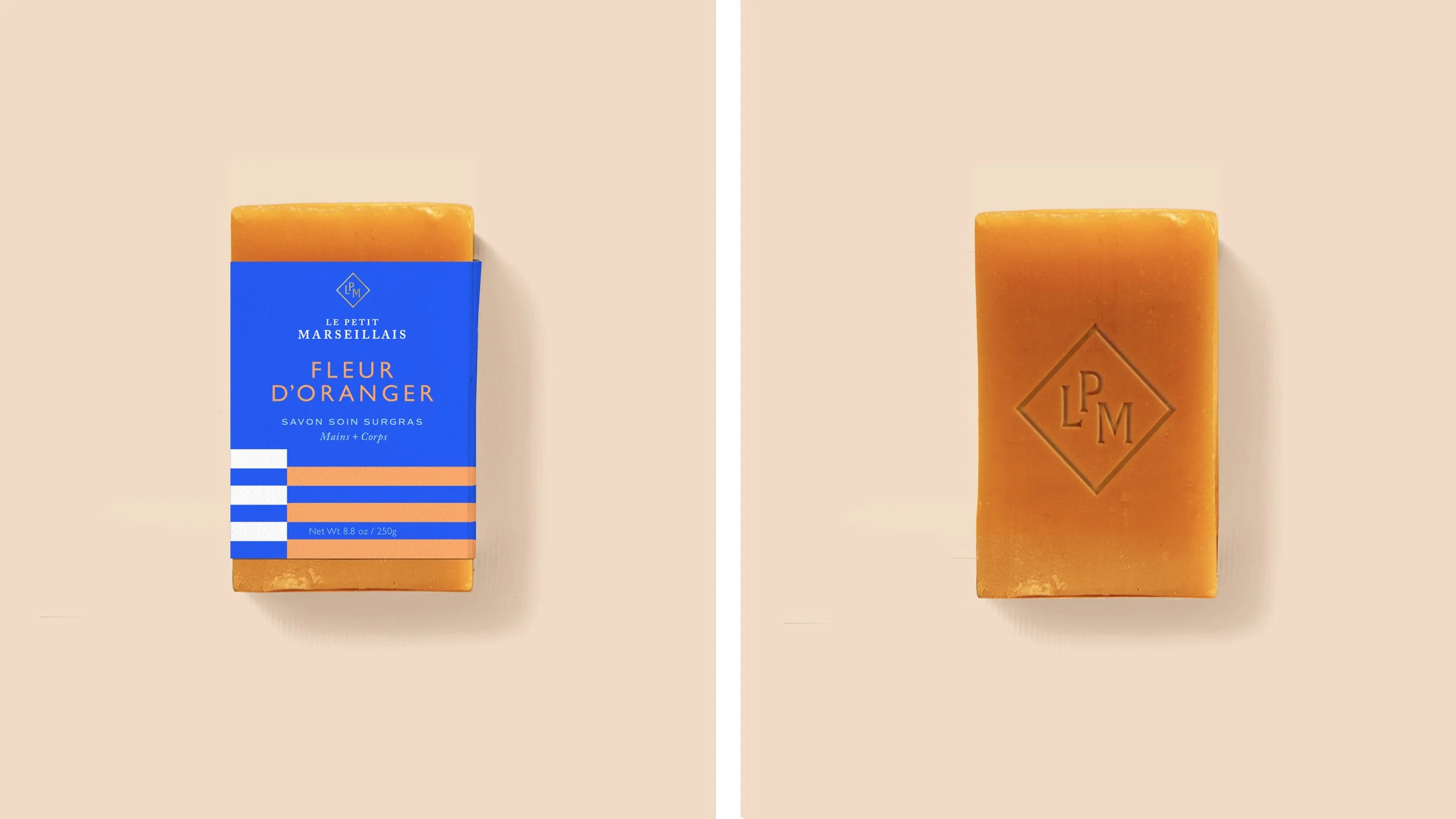
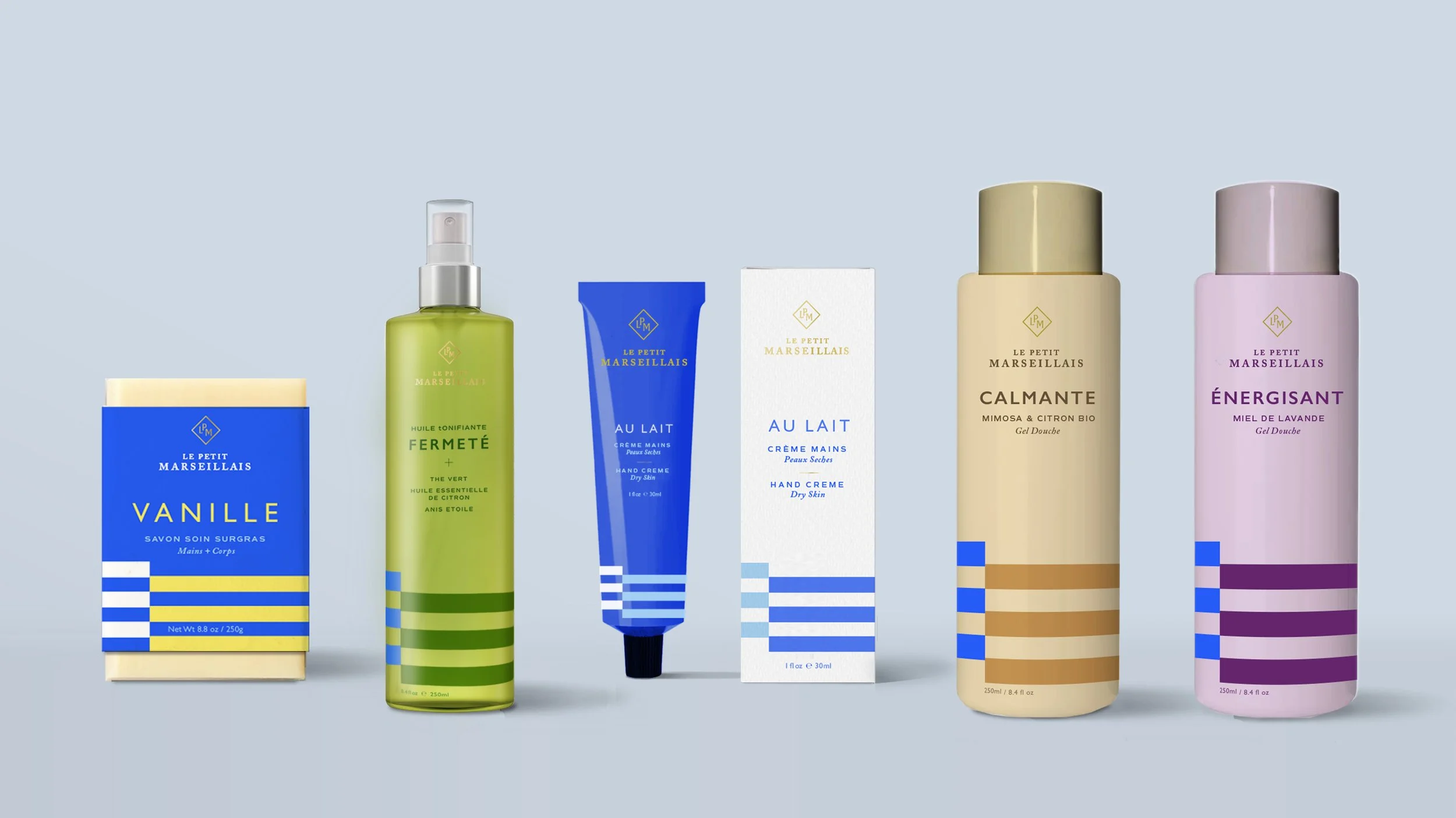
The iconic nautical stripes act as the primary graphic element throughout the portfolio, changing in scale and color, but lending a consistent and recognizable foundation to each piece of packaging.