Johnson & Johnson: Clean & Clear
PROJECT OVERVIEW
My work as Global Design Director for Clean & Clear included leading a number of product launches in emerging markets. These projects were strategically informed by regional specificities: beauty standards, consumer behavior, and market dynamics all had nuances unique to each area. Our team, in partnership with regional brand leaders, juggled these unique drivers with maintaining a globally cohesive portfolio— a task made more difficult by variations in local manufacturing capabilities.
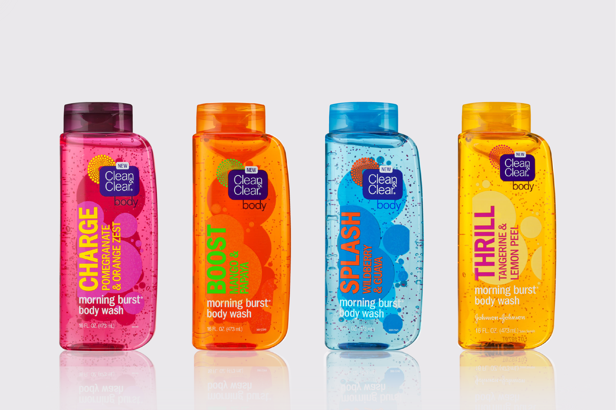
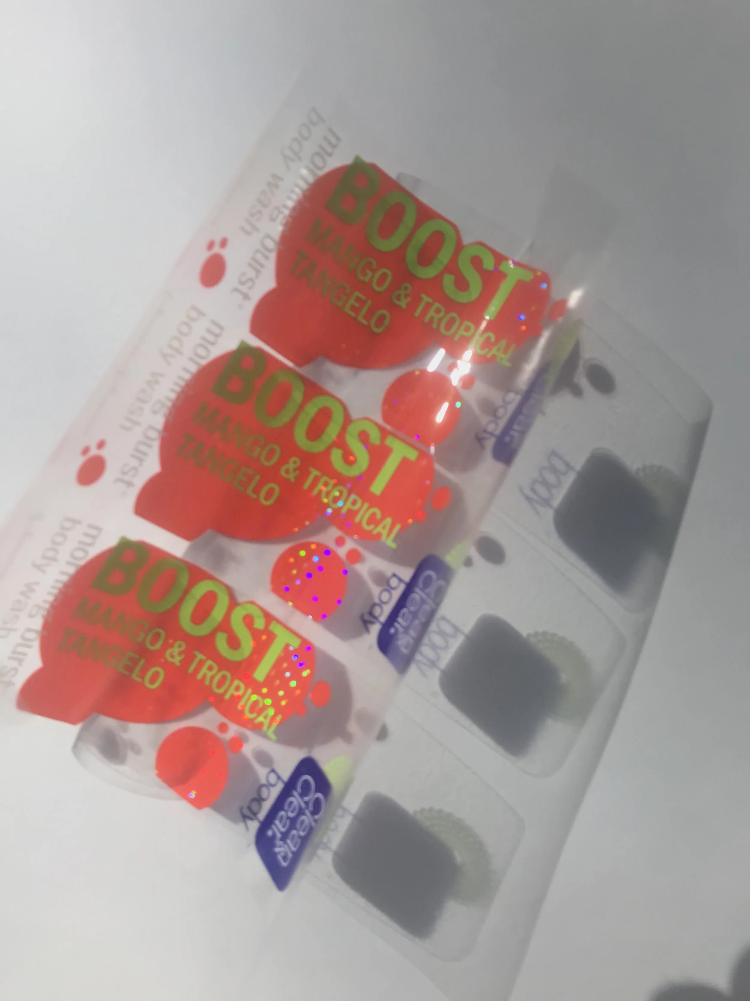
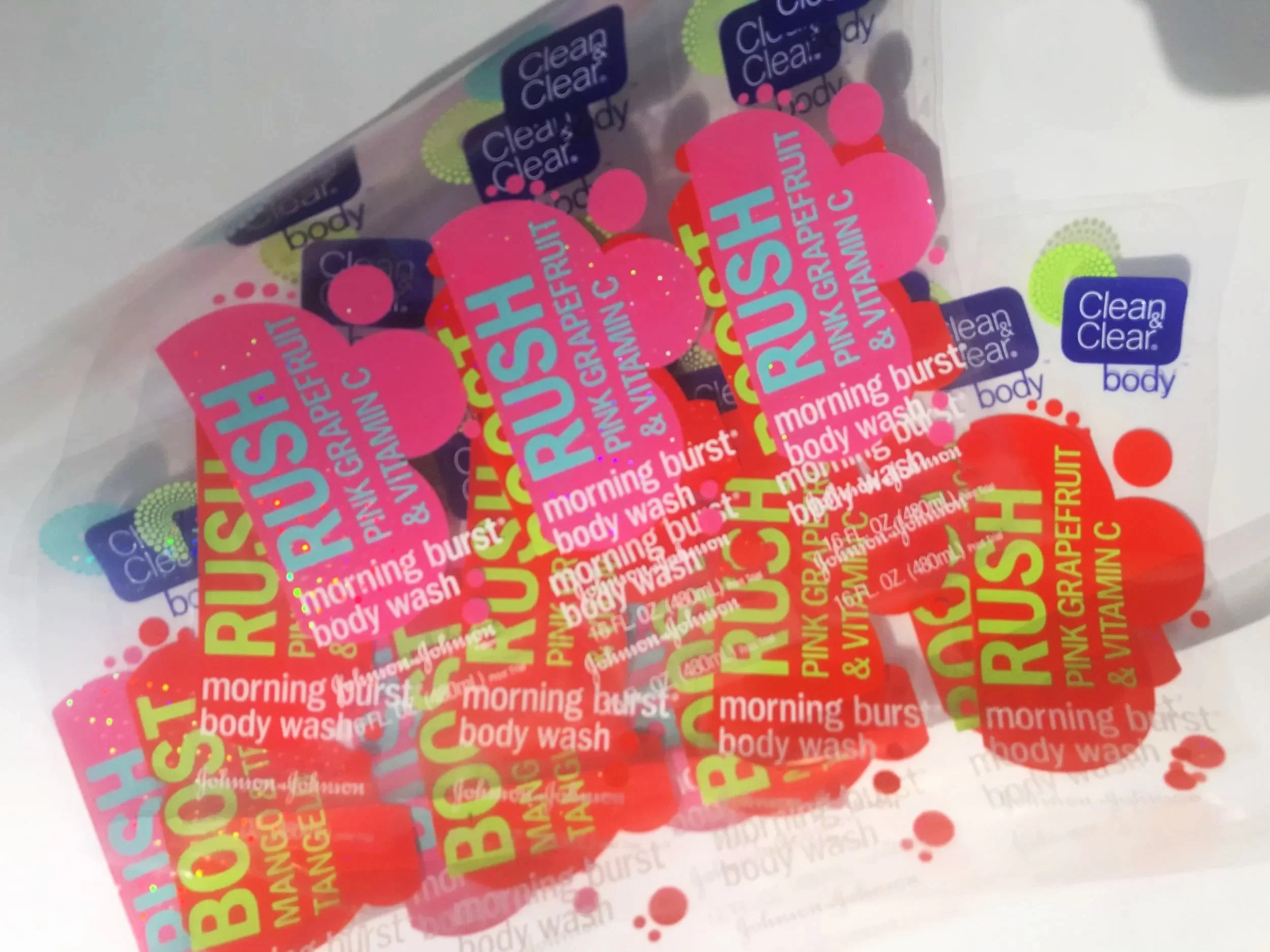
We also undertook Clean & Clear’s first foray into an entirely new category with the launch of Body Care. This launch was nformed by data showing the large number of consumers also worried about body acne. Boldly-scented, with impactful graphics, these washes expanded on the visual language of the popular Morning Burst line, while reflecting important category conventions in the body wash aisle.
CREDITS
Agency: Johnson & Johnson
Global Strategic Design Office
CCO: Chris Hacker
CD: Elan Cole
Design Director: Timothy O’Donnell
Sr Designer: Raluca Preda
Agency Partners:
Case Agency
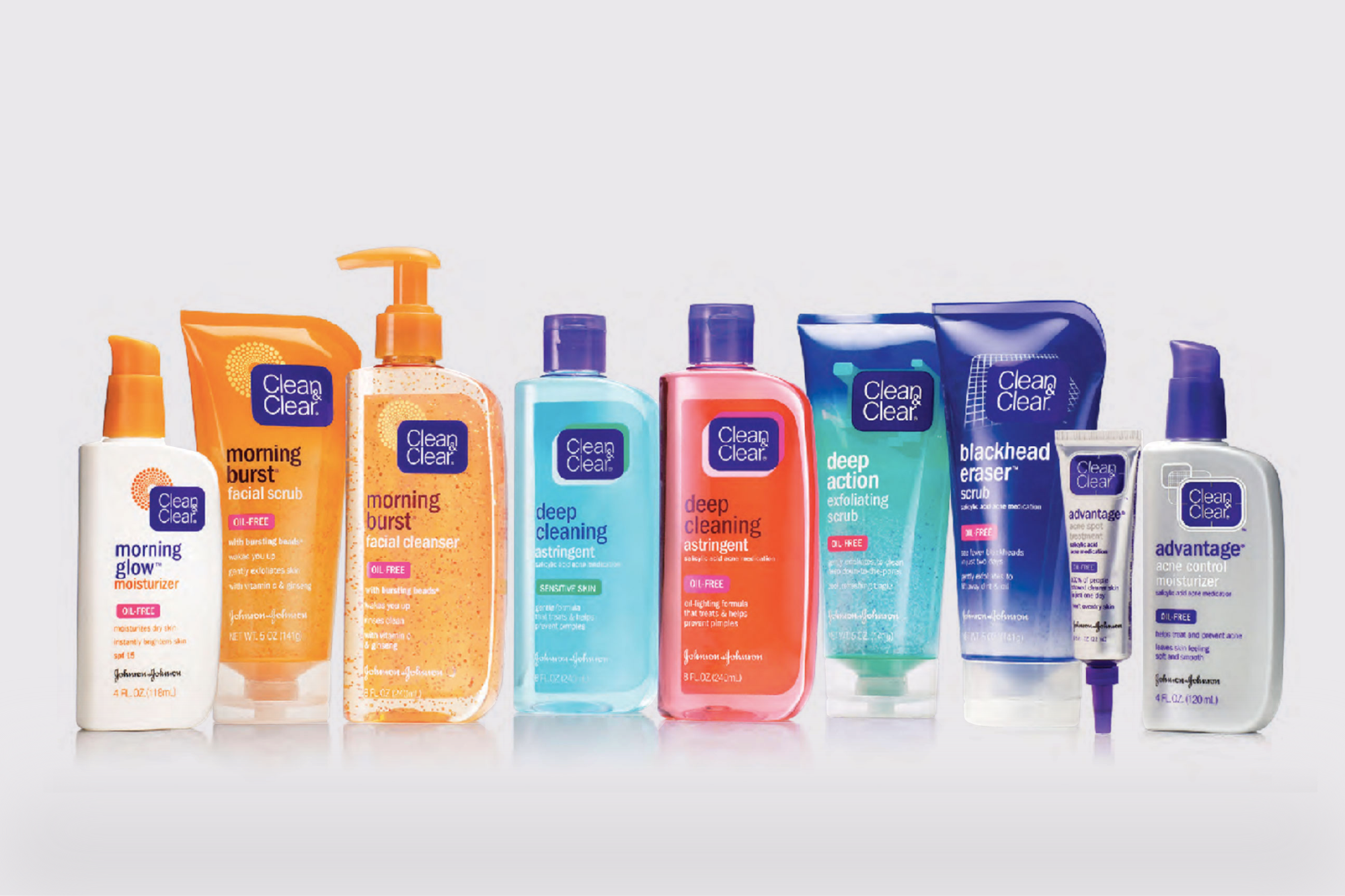
Clean & Clear — Core products
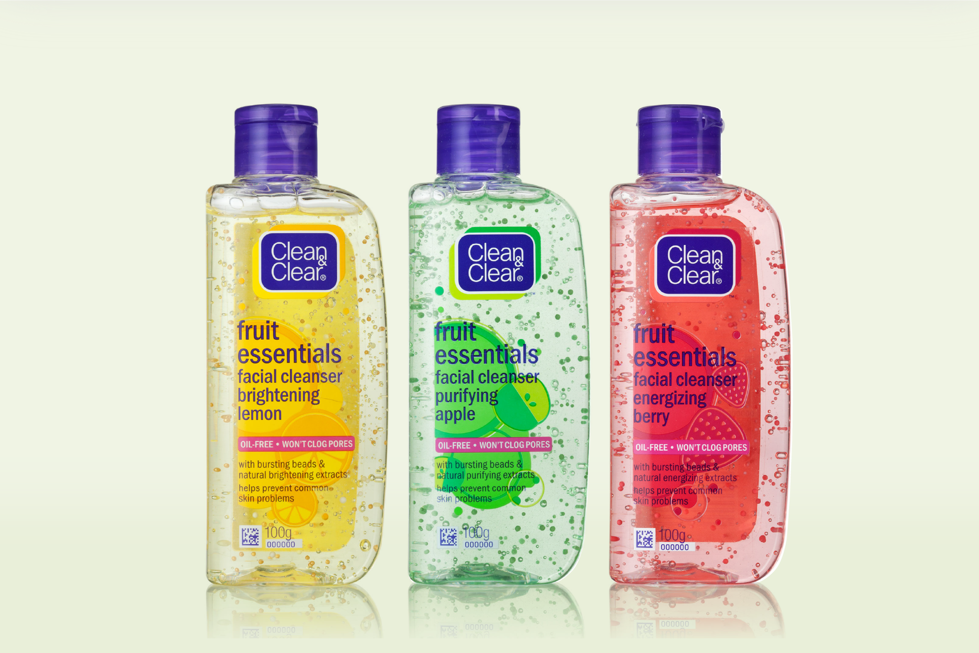
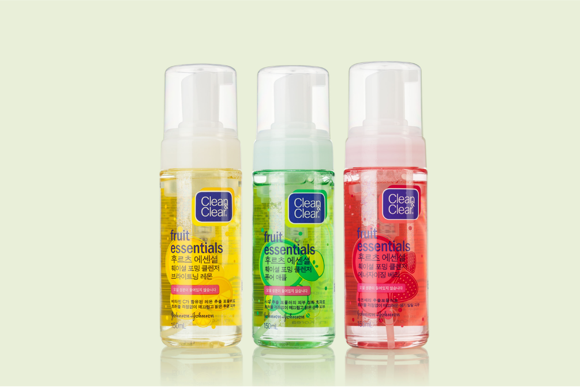
Fruit Essentials line extension
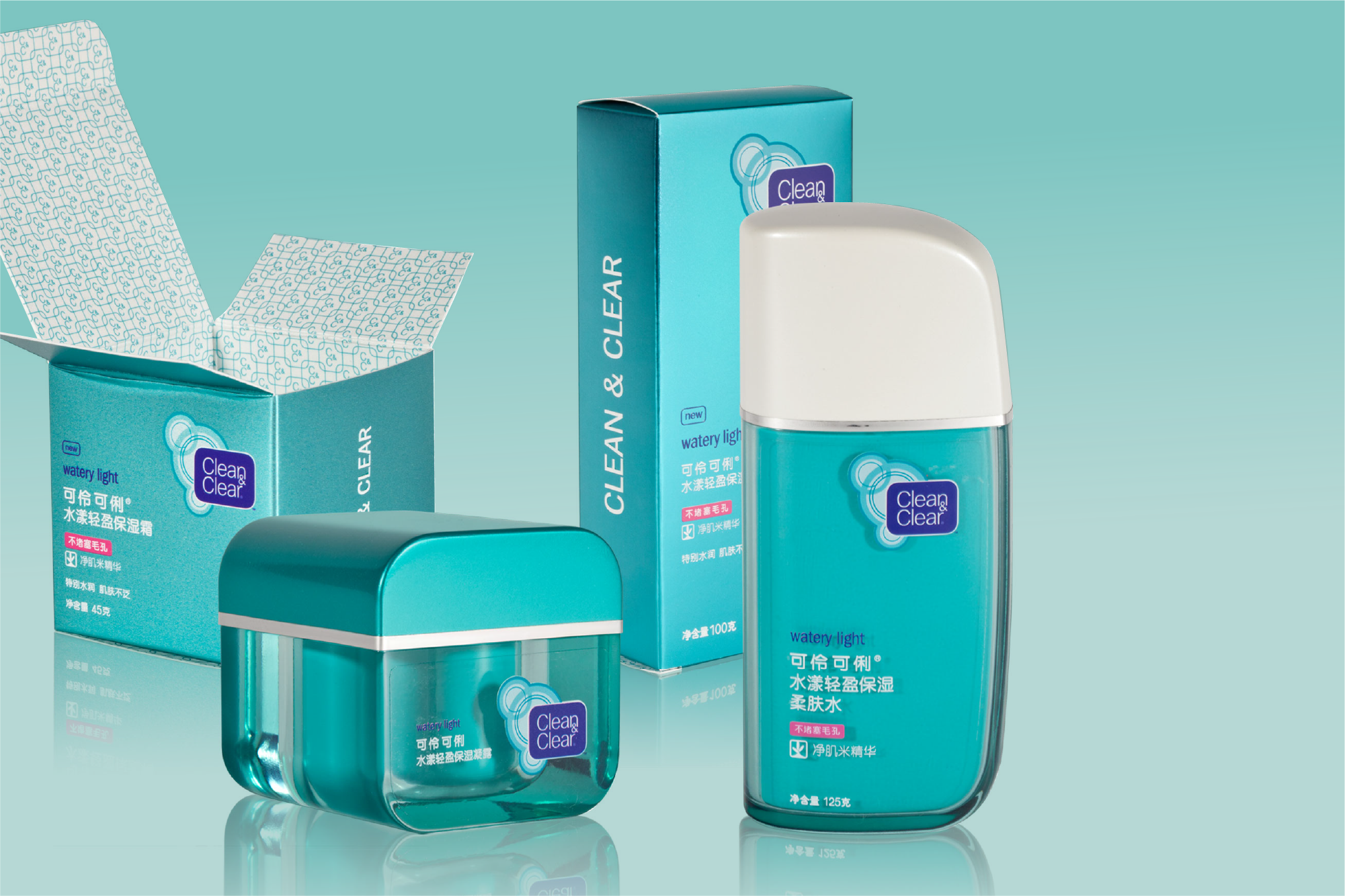
APAC Premium Launch: Watery Light
This pattern was developed to be printed on the inside of premium cartons
Custom Forms
The premium nature of this launch dictated new primary packaging; we partnered closely with our Product Design team to create glass containers that married aspirational elegance with the curved shoulder we had developed for the core range of Clean & Clear products.
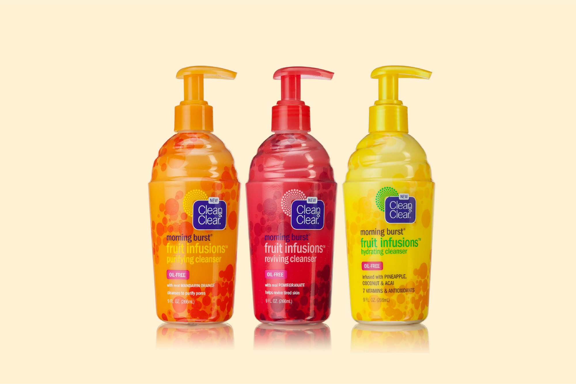
Morning Burst: Fruit Infusions line extension
APAC Launch: Finishes
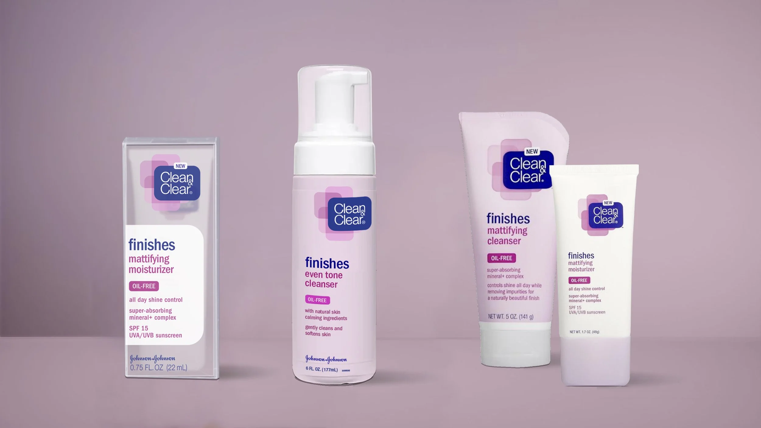
Launching Clean & Clear’s first non-facial product line